Australian heatwave,2009
Bildnummer 11552448
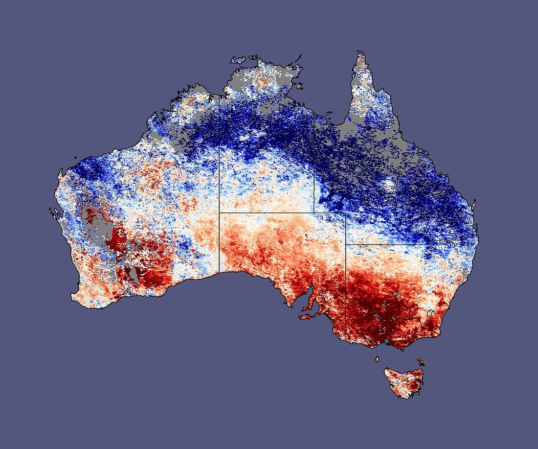
| Australian heatwave. Global map showing the average land surface temperature from 25th January to 1st February 2009,compared to the average mid-summer temperature over previous years (2000-2008). Red indicates hotter temperatures; white normal; and blue cooler. The extremes (dark blue and dark red) were ten degrees Celsius cooler and hotter than the average. Some power companies have been unable to cope with increasing demand and the heat in the south has claimed at least 22 lives. Data obtained by the MODIS sensor on NASA's Terra satellite | |
| Lizenzart: | Lizenzpflichtig |
| Credit: | Science Photo Library / NASA |
| Bildgröße: | 4080 px × 3400 px |
| Modell-Rechte: | nicht erforderlich |
| Eigentums-Rechte: | nicht erforderlich |
| Restrictions: | - |
Preise für dieses Bild ab 15 €
Universitäten & Organisationen
(Informationsmaterial Digital, Informationsmaterial Print, Lehrmaterial Digital etc.)
ab 15 €
Redaktionell
(Bücher, Bücher: Sach- und Fachliteratur, Digitale Medien (redaktionell) etc.)
ab 30 €
Werbung
(Anzeigen, Aussenwerbung, Digitale Medien, Fernsehwerbung, Karten, Werbemittel, Zeitschriften etc.)
ab 55 €
Handelsprodukte
(bedruckte Textilie, Kalender, Postkarte, Grußkarte, Verpackung etc.)
ab 75 €
Pauschalpreise
Rechtepakete für die unbeschränkte Bildnutzung in Print oder Online
ab 495 €
Keywords
- 21. Jahrhundert,
- ausgeschnitten,
- Ausschnitte,
- Australien,
- australisch,
- Erdbeobachtung,
- Erde,
- Erdkunde,
- Erwärmen,
- Februar,
- Globale Erwärmung,
- Januar,
- Klima,
- klimatisch,
- Klimatologie,
- klimatologisch,
- Klimawandel,
- Kühler,
- Kühlung,
- Land,
- Meteorologie,
- meteorologisch,
- modis,
- planetarisch,
- Satellit,
- Satellitenbild,
- Sommer,
- Spektroradiometer,
- Terra,
- tödlich,
- Welt,
- Weltall,
- weltweit,
- Wetter,
- Wissenschaften