Global particulate pollution 2010-2012, satellite map
Bildnummer 12257725
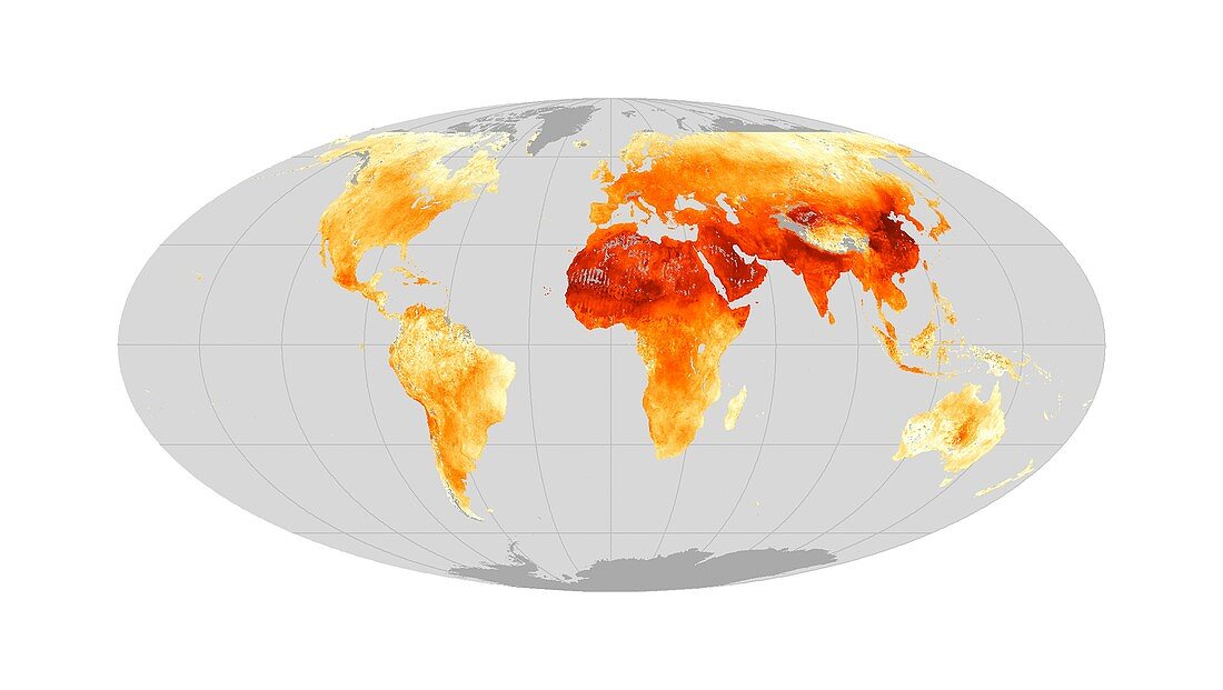
| Global particulate pollution 2010-2012. Satellite map showing the worldwide distribution of particulate pollution, showing the average (mean) exposure for the years 2010 to 2012. This form of pollution is known as PM2.5, because the pollution particles have diameters less than 2.5 micrometres. Darker orange areas show relatively higher levels of exposure. Dust and salt are significant contributors to the levels over the Sahara Desert and the Arabian Peninsula. This research, published in 2015, found that global PM2.5 exposure had increased by an average of 2.1 percent per year from 1998 to 2012. The data was obtained from a range of different satellite sensors. | |
| Lizenzart: | Lizenzpflichtig |
| Credit: | Science Photo Library / NASA Earth Observatory |
| Bildgröße: | 3932 px × 2219 px |
| Modell-Rechte: | nicht erforderlich |
| Eigentums-Rechte: | nicht erforderlich |
| Restrictions: | - |
Preise für dieses Bild ab 15 €
Universitäten & Organisationen
(Informationsmaterial Digital, Informationsmaterial Print, Lehrmaterial Digital etc.)
ab 15 €
Redaktionell
(Bücher, Bücher: Sach- und Fachliteratur, Digitale Medien (redaktionell) etc.)
ab 30 €
Werbung
(Anzeigen, Aussenwerbung, Digitale Medien, Fernsehwerbung, Karten, Werbemittel, Zeitschriften etc.)
ab 55 €
Handelsprodukte
(bedruckte Textilie, Kalender, Postkarte, Grußkarte, Verpackung etc.)
ab 75 €
Pauschalpreise
Rechtepakete für die unbeschränkte Bildnutzung in Print oder Online
ab 495 €