Map of global population densities
Bildnummer 11735574
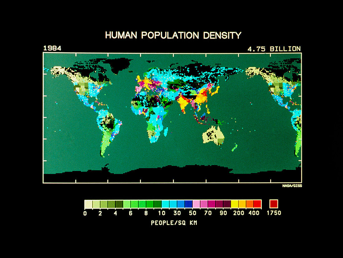
| Computer-generated map of the world showing the distribution and density of the human population. The map was created using the published population statistics for 1984 which were provided by each country. Notice that the population density of each individual political unit (for example the separate states in the USA,and the different countries in Africa) appears homogenous; this is because the population has been averaged over the whole area. However,individual cities with populations in excess of 100,000 have been mapped separately. Black areas indicate an absence of data | |
| Lizenzart: | Lizenzpflichtig |
| Credit: | Science Photo Library / NASA, GODDARD INSTITUTE FOR SPACE STUDIES |
| Bildgröße: | 3543 px × 2661 px |
| Modell-Rechte: | nicht erforderlich |
| Eigentums-Rechte: | nicht erforderlich |
| Restrictions: | - |
Preise für dieses Bild ab 15 €
Universitäten & Organisationen
(Informationsmaterial Digital, Informationsmaterial Print, Lehrmaterial Digital etc.)
ab 15 €
Redaktionell
(Bücher, Bücher: Sach- und Fachliteratur, Digitale Medien (redaktionell) etc.)
ab 30 €
Werbung
(Anzeigen, Aussenwerbung, Digitale Medien, Fernsehwerbung, Karten, Werbemittel, Zeitschriften etc.)
ab 55 €
Handelsprodukte
(bedruckte Textilie, Kalender, Postkarte, Grußkarte, Verpackung etc.)
ab 75 €
Pauschalpreise
Rechtepakete für die unbeschränkte Bildnutzung in Print oder Online
ab 495 €