Mercator map projection,diagram
Bildnummer 11621226
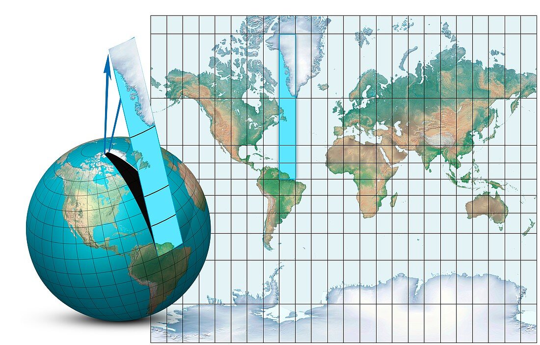
| Mercator map projection. Diagram of an Earth globe (left) and a Mercator map projection (right) with the blue strip (from South America to Greenland) showing how the spherical surface is projected onto a cylindrical map. The arrows (blue) show how the polar regions are narrower on the globe,and wider on the map. This is one of the disadvantages of this projection,which distorts the polar regions compared to the equatorial regions. Greenland and Antarctica appear much larger on the map than on the globe. This standard projection is named for the Flemish geographer and cartographer Gerardus Mercator who used it in 1569 | |
| Lizenzart: | Lizenzpflichtig |
| Credit: | Science Photo Library / Lunau, Claus |
| Bildgröße: | 5906 px × 3780 px |
| Modell-Rechte: | nicht erforderlich |
| Eigentums-Rechte: | nicht erforderlich |
| Restrictions: | - |
Preise für dieses Bild ab 15 €
Universitäten & Organisationen
(Informationsmaterial Digital, Informationsmaterial Print, Lehrmaterial Digital etc.)
ab 15 €
Redaktionell
(Bücher, Bücher: Sach- und Fachliteratur, Digitale Medien (redaktionell) etc.)
ab 30 €
Werbung
(Anzeigen, Aussenwerbung, Digitale Medien, Fernsehwerbung, Karten, Werbemittel, Zeitschriften etc.)
ab 55 €
Handelsprodukte
(bedruckte Textilie, Kalender, Postkarte, Grußkarte, Verpackung etc.)
ab 75 €
Pauschalpreise
Rechtepakete für die unbeschränkte Bildnutzung in Print oder Online
ab 495 €