US Energy consumption , illustration
Bildnummer 13744003
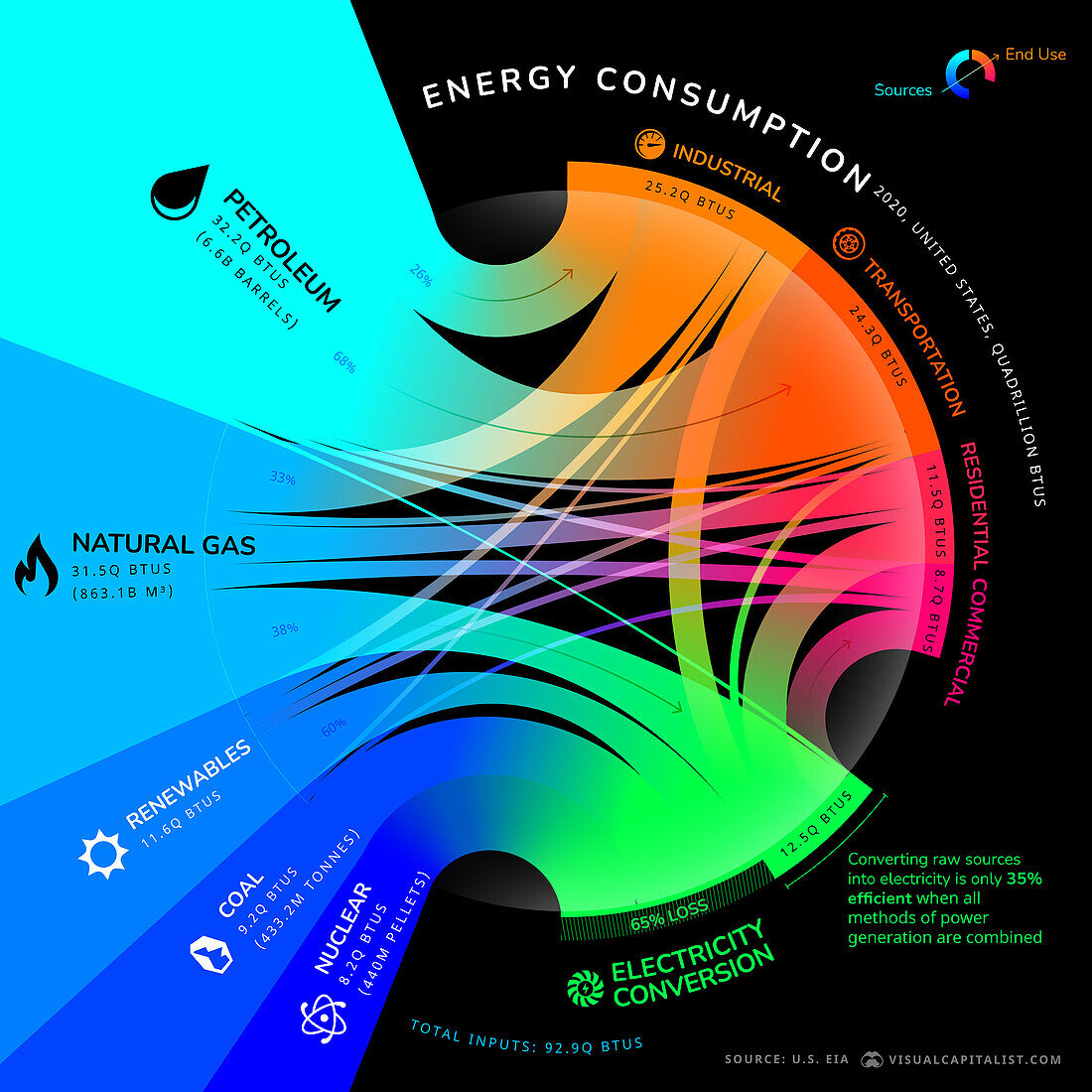
| Infographic illustration charting the flow of energy in the USA from energy source to end user. Listed at left are the main forms of energy available in the US (petroleum, natural gas, renewable sources, coal, nuclear). The coloured pathways indicate the main end users (far right) for the fuel source. Units are measured in quadrillion BTUs (British Thermal Units). The chart also shows how much energy is wasted converting raw sources into electricity (65& loss). Data based on 2020 figures by the US Energy Information Administration. | |
| Lizenzart: | Lizenzfrei |
| Credit: | Science Photo Library / VISUAL CAPITALIST |
| Modell-Rechte: | nicht erforderlich |
| Eigentums-Rechte: | nicht erforderlich |
| Restrictions: | - |
Preise für dieses Bild ab 29 €
Für digitale Nutzung (72 dpi)
ab 29 €
Für Druckauflösung (300 dpi)
ab 300 €